

In today’s mobile-first world, ensuring your email looks flawless on smaller screens is crucial. The Mobile Styles section allows you to make specific styling adjustments for mobile devices, guaranteeing a seamless viewing experience for your audience.
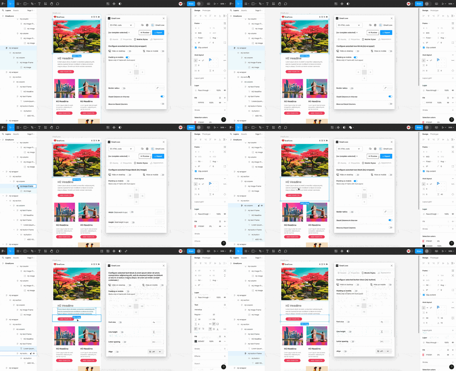
Layers that Support Mobile Styles
You will need to select a layer that you would like to apply mobile styles to. The following layers are supported:- mj-wrapper: Show or hide a wrapper on mobile, update the padding, and stack or reverse stack columns.
- mj-text-frame: Customize your text on mobile. Show or hide the text component, add padding, or update the font size, line-height and alignment.
- mj-image-frame: Show or hide on mobile, add padding around your image on mobile, or make the image fill its column’s height.
- mj-button-frame: Show or hide a button component on mobile. Update padding and text style.
Applying Mobile Styles to Different Components
Wrapper Optimization
- Click on the wrapper you want to adjust, then select the Mobile Styles tab in the Plugin interface.
- Choose to hide the wrapper on either desktop or mobile devices, or both.
- Enable and set padding to ensure proper spacing and alignment on mobile devices.
- If required, set the following options:
- Border Radius: Add a border radius around the wrapper.
- Stack Columns: For multi-column wrappers, you can stack columns into a row for better readability on mobile.
- Reverse Stack Columns: Reverse the order of stacked columns if needed.
Text Optimization
- Click on the text frame you want to optimize.
- Choose to hide the text on either desktop or mobile devices.
- Enable and set padding to ensure proper spacing and alignment on mobile devices.
- Change the font size, line height, letter spacing, and alignment of the text for mobile users.
Image Optimization
- Click on the image frame you want to optimize.
- Choose to hide the image on either desktop or mobile devices.
- Enable and set padding to ensure proper spacing and alignment on mobile devices.
- Change the width and height of the image for mobile users to ensure it fits well on smaller screens.
- Turn on Fill Column Height if the image should fill the full height of its column. See below.
Fill Column Height
Side-by-side columns match the height of the tallest one, so a column that holds only an image can end up taller than the image. Turn on Fill Column Height, below the Width and Height settings, to stretch the image to fill its column. The image keeps its proportions and is cropped at the edges to fill the space, rather than being distorted.- It’s off by default and set per image. Nothing changes until you turn it on for a specific image.
- It applies only when the image is the only content in its column, or the only content in an Inner Column card. An image that shares a column with text or a button keeps its normal size.
- It applies while columns sit side by side, which is when column heights are matched.
- Classic Outlook for Windows and the Outlook mobile apps show the image uncropped at its normal size. That’s what the note under the switch means by “Outlook shows it uncropped.”
Button Optimization
- Click on the button frame you want to optimize.
- Choose to hide the button on either desktop or mobile devices.
- Enable and set padding to ensure proper spacing and alignment on mobile devices.
- Change the font size, line height, letter spacing, and alignment of the text within the button.
- Adjust the width, height, and border radius of the button to make it more touch-friendly for mobile users.
Setting a Custom Mobile Breakpoint
Every template switches from desktop to mobile styles at a breakpoint width. You can now set your own per template, instead of relying on a single fixed value for every design.- Select your Main Frame in Figma, then open the Mobile Styles tab.
- At the top of the panel, enter a pixel value in the Breakpoint field. Leave it blank to use the frame’s own width as the placeholder default.
- Any screen narrower than your breakpoint receives the mobile styles you’ve set on this tab (padding, font size, alignment, hide/show, and everything else covered above). Anything at or wider uses your desktop styles.
If you have existing templates: previously, every template switched to mobile styles at a fixed 768px, regardless of its own width. Leaving the Breakpoint field blank now uses the template’s own frame width instead. For templates built at 768px wide this changes nothing, but if your frame is a different width, set an explicit Breakpoint value to match your template’s prior behavior exactly.
Example Usage
- Mobile-Specific Padding
- For a text block, add 10px padding on mobile to ensure it has enough breathing space.
- Stack Columns
- For a multi-column wrapper with text and images, stack the columns so that the text appears above the image on mobile.
- Adjust Button Size
- Increase the height of a button to 50px on mobile to make it easier to tap.
- Hide Elements
- Hide large images on mobile to reduce loading time and improve readability.