

The Components tab
Open a design system and go to Components.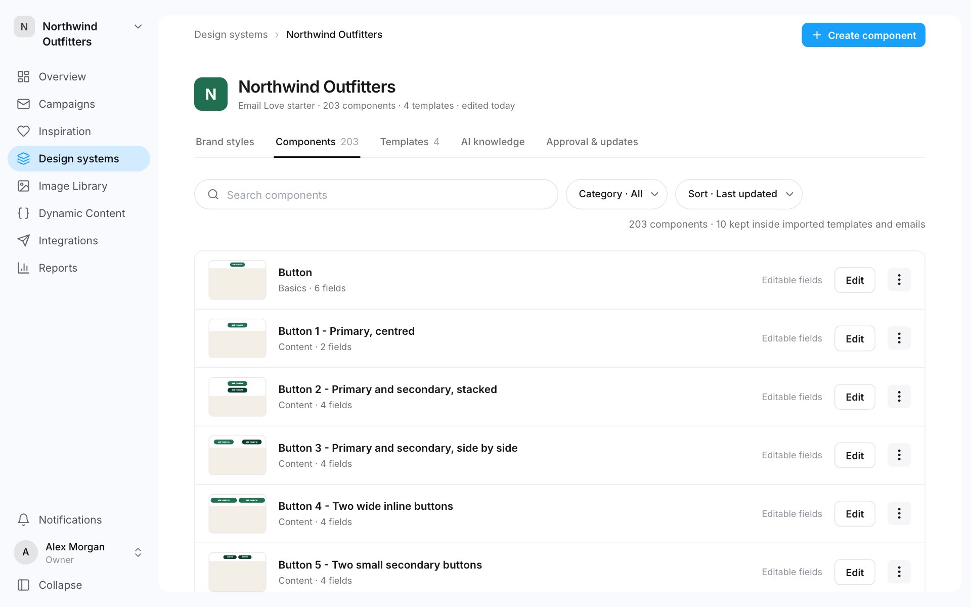
- Search with Search components, filter with Category, and sort by Last updated or Name.
- Each row shows what marketers can change: Editable fields, a number of locked fields, Fields locked, or No fields.
- Click Edit to open the component in Component Studio.
- The ⋯ menu has Edit fields & permissions and Download component source.
Add components
- Create component: click Create component, enter a Component name and click Create and build. Component Studio opens on an empty component.
- Add from starter: add Email Love’s starter components to your design system, styled with your brand. Tick the ones you want and click Add. The button shows how many, for example Add 3 modules. This button shows when there are starter components your design system doesn’t have yet.
- From Figma or your emails: setup builds components for you. See Create a design system.
- From an email: in the editor, a section’s toolbar has Save as component. Design system managers see it.
Component Studio
Component Studio is where you design a component.- The left rail has Layers, Blocks and Layouts, and AI chat. See AI chat.
- Switch between Visual and Code at the top.
- The right panel has four tabs:
- Assistant: ask for a change in plain words.
- Style: the selected element’s styles.
- Mobile: phone-only styles.
- Permissions: what marketers can change. See below.
- Settings sets the component’s label, description and section. Version history lists its published versions. Restore as draft brings an old version back to edit.
- Preview in email tries your draft in an existing email or template. Nothing is saved to it.
Decide what marketers can change
Open the Permissions tab.- Lock entire component keeps its content and styling fixed in emails and templates, including Assistant edits. People can still move, duplicate or remove the section.
- Lock mobile styling stops phone-only changes and device visibility changes. Copy and images can still be edited.
- Each field has a switch. On, marketers can edit it. Off, only templates set it, and emails use the template’s content.
- Required before export: the email can’t be exported while it’s empty.
- Character limit, or Fewest items and Most items for lists.
- Starting content & guidance: the content a new section starts with, and a note for the person filling it in.
Show and hide properties
A show/hide property lets marketers switch part of a component off in one email without a different component. For example, a hero with an optional button, or a product card with an optional badge.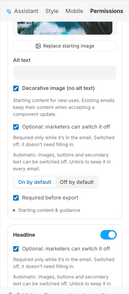
- Open the component in Component Studio and go to Permissions.
- On the part, tick Optional: marketers can switch it off.
- Choose On by default or Off by default.
- Publish the component.
Publish a component
Changes in Component Studio are a draft until you publish them.- Click the publish button at the top right. It names the next version, for example Publish v2. For small changes, such as the name or description, it says Save instead.
- Add a note under What changed? if you like.
- Click Publish.
How updates reach emails
Publishing doesn’t change emails behind your back.- Templates take the update by themselves, unless the update would change their content or they’re in review or approved.
- Emails keep the version they have until someone accepts the update.
- After you publish, choose Update it or Update all in the dialog.
- On the design system’s Approval & updates tab, under Component updates, click Update emails or review them one at a time.
- In an email, open the ⋯ menu at the top left and choose Check for updates.