

Add a section
- A component: open Components in the left rail. Click a component to add it, or drag it to where you want it. A bar shows where it will land.
- A layout row: open Layouts and drag in a row with one to six columns. Then open Blocks and drag content into a column: text, an image, a button and so on.
Move, duplicate and remove sections
Click a section to select it. A toolbar appears under it.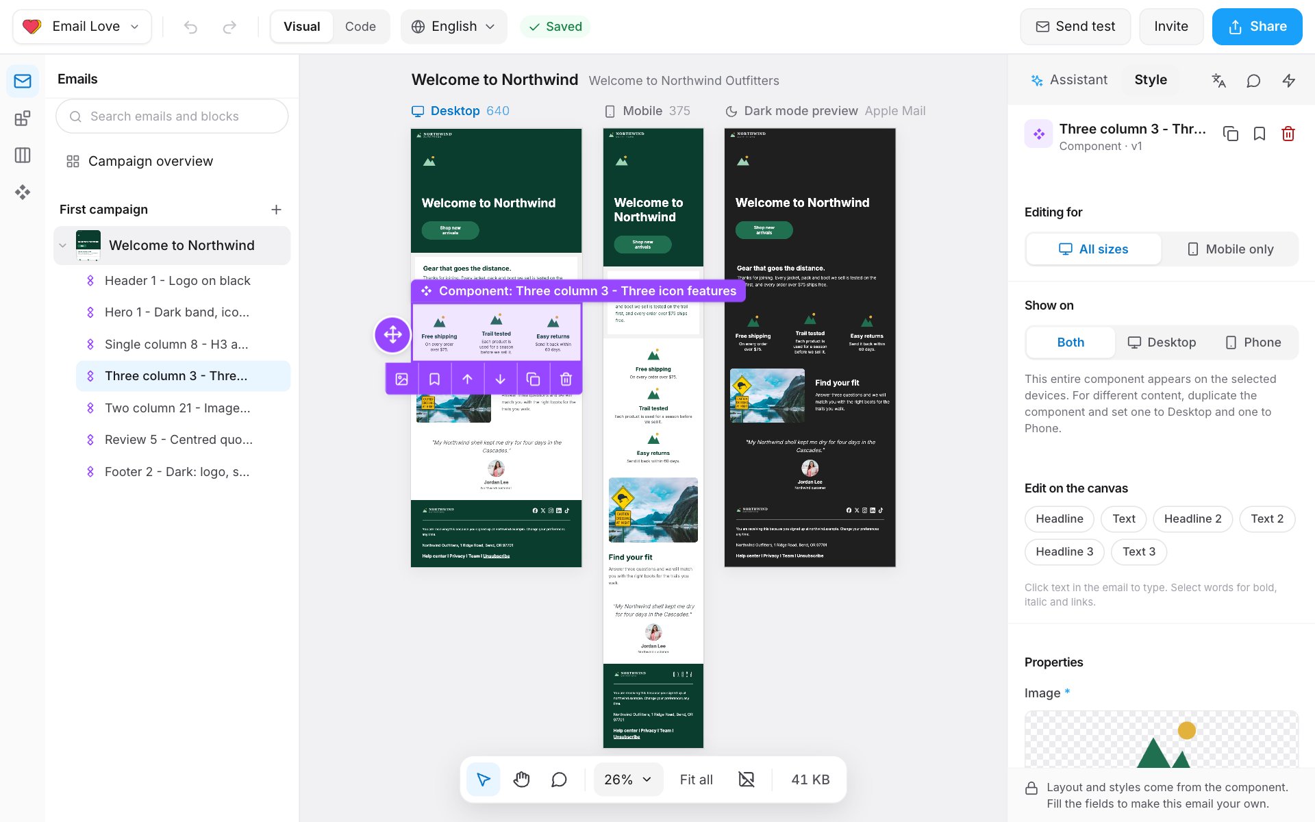
You can also drag the round handle on the left of a section, or drag rows in the outline under Emails. Each row in the outline has a ⋯ menu with Copy to another email… and Download as image as well.
You can’t add, move or remove sections when:
- the email comes from a template with a Fixed layout. You fill in the open parts of each component.
- your role can’t change structure. You can still edit the copy and images.
- the email is a variant. Change sections in the original email.
Edit text
- Click text on the Desktop preview and type.
- Select words to show the text toolbar: Bold, Italic, Underline, Strikethrough, Text colour, Highlight, Link and more. More options shows Superscript, Subscript, Special characters, Emoji, Non-breaking space and Clear formatting.
Add a link
- Select the words, or select a button.
- Click Link and enter a web address or a merge tag.
- Click Apply link.
Add a merge tag
Select where you want it and choose Merge tags in the text toolbar. The Subject and Preview text fields have Personalise for the same list. Merge tags come from Dynamic Content. If the list is empty, a workspace owner adds them there. See Conditions and merge tags.Change an image
- Click the image.
- Pick one from the Image Library, upload a new one, or drop a file on the image.
Change a button
Click the button’s edge to select it. In the Style panel, pick a button style from Buttons. The styles come from your brand. Edit the label on the canvas.Show or hide parts of a section
Many components have parts you can switch off for one email, such as a hero’s button or a card’s badge. Select the section and look under Show in this email. Each part has a switch. A part that’s off shows Not in this email. Which parts can be switched off is set in the design system. See Show/hide properties.Show a section on desktop or phone only
Select the section and use Show on: Both, Desktop or Phone. To show different content on each, duplicate the section and set one to Desktop and one to Phone.Phone-only changes
To change how a section looks on phones without changing desktop:- Click the section on the Mobile preview, or choose Mobile only under Editing for in the Style panel.
- Make your changes. The panel shows Editing phone only.
Locked components
Your design system decides what can change in each component. In an email:- A component’s layout and styles always come from the design system. The panel says “Layout and styles come from the component.”
- A fully locked component can’t be edited at all. The panel says “This component is locked. A designer can change it in Component Studio.” You can still move, duplicate or delete it.
- A component with locked mobile styling can’t have phone-only changes.
- In an email made from a template, fields the template locks show Set by the template.
Undo and save
- Undo and Redo are in the top bar, or press ⌘ Z and ⌘ Shift Z. Undo goes back up to 100 steps. When others are editing, it only undoes your own changes.
- The editor saves about two seconds after each change. If a save fails, you see Your changes have not been saved and a Retry save button.